


TLDR: A stock chart is a picture of supply and demand. Learn to read seven things on it and you can look at any stock and know, in about ten seconds, whether it is worth your attention.
Contents
What a chart actually is. Price history, and what it is really showing you.
Reading a single bar. The smallest unit on the chart.
Volume. Elephant footprints.
Trend and moving averages. Reading the direction.
Why stocks move like stairs. They do not go straight up.
Support and resistance. Floors and ceilings.
How does it stack up against everything else. Relative strength.
Putting it all together. Four questions, in order.
I remember the first time I pulled up a chart while working at William O’Neil & Co. I was overwhelmed and discouraged. It looked like an EKG and I thought I’d never crack the code.
That feeling is the reason this post exists. Nobody is born knowing this. It is a skill, it is learnable, and the barrier is smaller than it looks from the outside.
Here is the thing nobody told me that day: a chart is not a prediction. It is a record. It is a picture of what buyers and sellers have already done with real money. Once you see it that way, the squiggles turn into a story.
Let’s read it.
What a chart actually is
A stock chart is price history. Price on the vertical axis, time on the horizontal. That is the whole structure.
But what it is really showing you is supply and demand.
Every point on that chart is a moment where a buyer and a seller agreed on a number. Price went up because buyers were more motivated than sellers. Price went down because sellers were more motivated than buyers. That is it. That is the entire mechanism.
When you look at a chart, you are looking at a visual record of an argument between two crowds, playing out over months, with money on the line.
Everything else in this post is just learning to read the details of that argument.
Reading a single bar
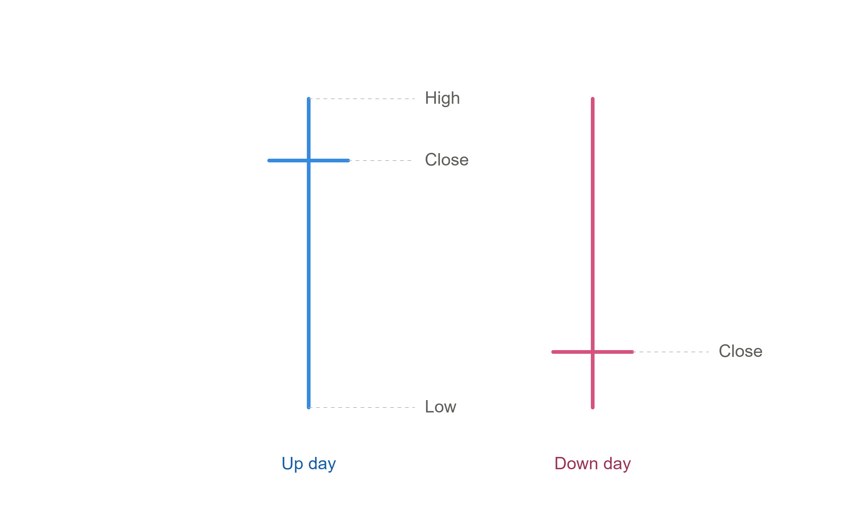
The smallest unit on your chart is one bar. Each bar is one day.
The vertical line shows the day’s full range. The top is the high, the highest price anyone paid that day. The bottom is the low, the cheapest anyone got it for.
The little tick on the right is the close, where the stock finished when the bell rang.
That tick is the part that matters.
If the close sits near the top of the range, buyers were in control when it counted. The stock fought its way up and held there. Most charts color that bar blue.
If the close sits near the bottom, sellers had the last word. Whatever the stock did during the day, it gave it back by the end. Usually pink or red.
The close is the only price in the day that everyone has to agree on. It is the day’s verdict.
Now look at a full chart and understand you are reading hundreds of those verdicts in a row.
Volume: elephant footprints
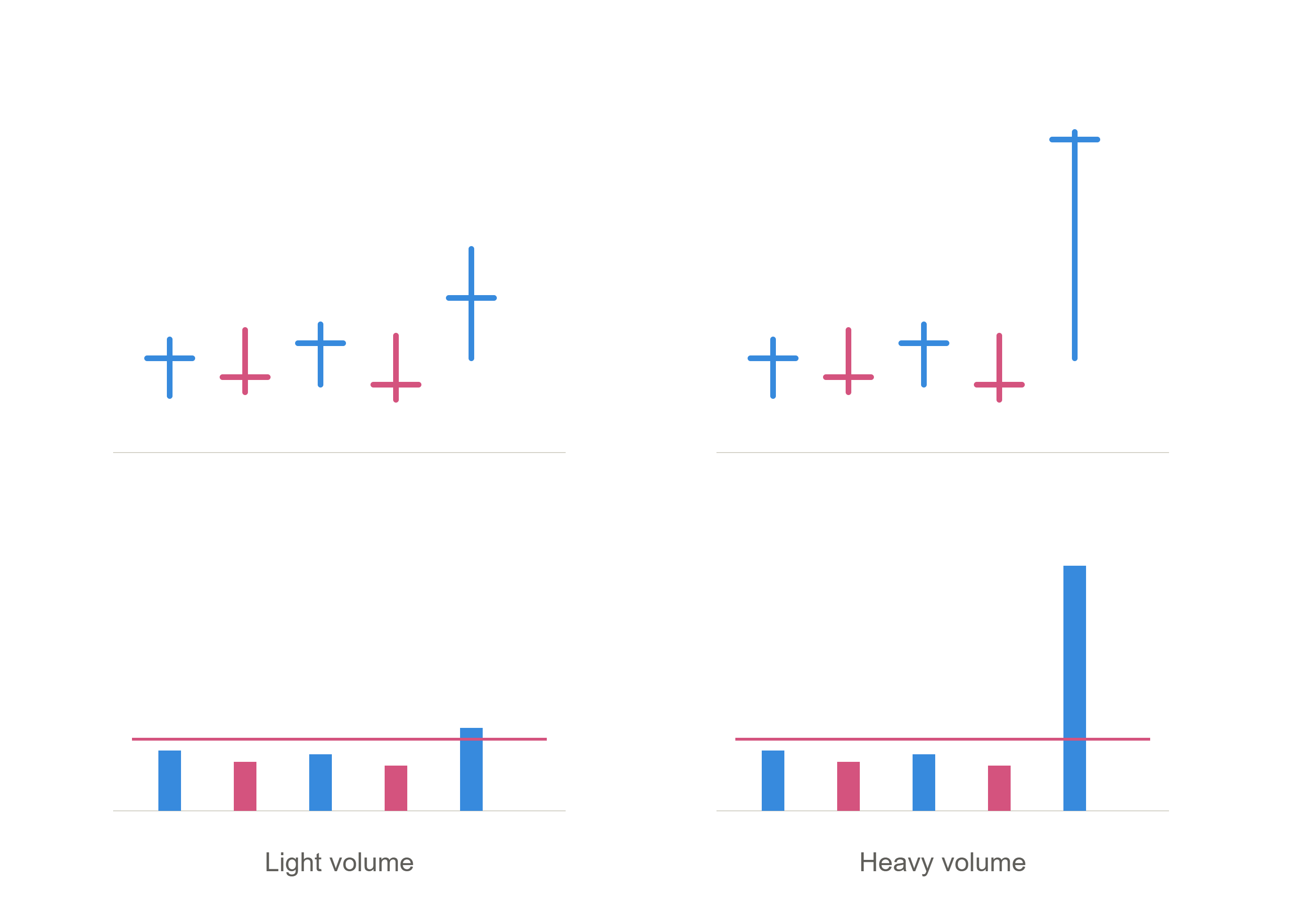
Under the price bars there is a second set of bars. That is volume, and it is the number of shares that traded that day.
Here is why it matters more than almost anything else on the chart.
The market is not moved by people like you and me. It is moved by institutions. Mutual funds, pension funds, hedge funds. When a fund decides to build a position in a stock, they are not buying a hundred shares. They are buying millions, and they cannot do it in a day, so they do it over weeks.
You cannot see them. But you can see their footprints.
Volume is how you spot the elephants. When a stock moves up on huge volume, that is not retail traders. That is institutional money coming in. When a stock drops on huge volume, institutions are getting out.
Price tells you what happened. Volume tells you who did it, and whether they meant it.
A stock rising on light volume is a stock rising without conviction. A stock rising on volume well above its average is a stock with an elephant behind it.
Learn to look at price and volume together, always. They are one signal, not two.
Trend and moving averages: reading the direction
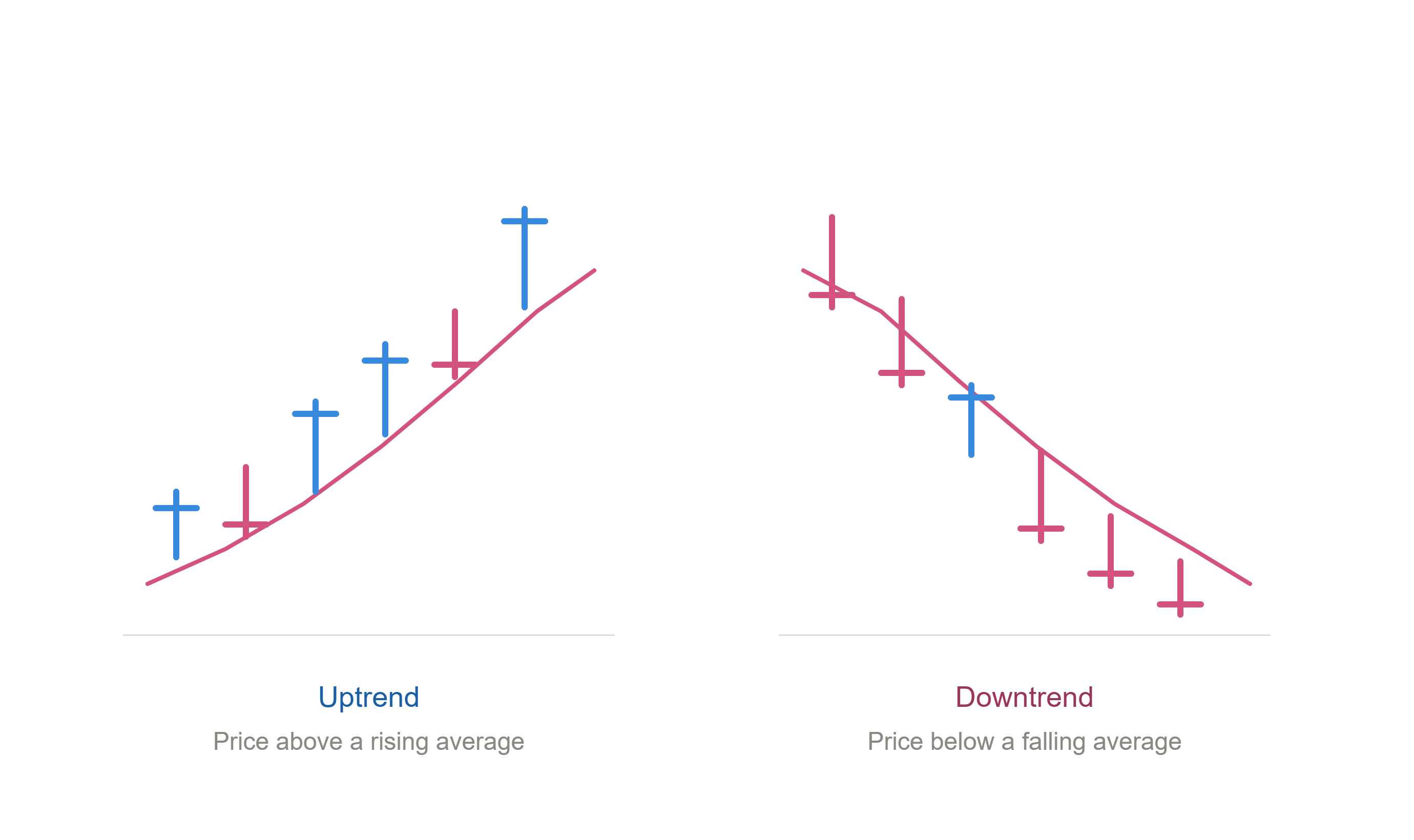
A moving average is the average price of a stock over a set number of days, plotted as a line. The 50-day moving average is the average closing price of the last 50 days. Every day it updates.
That sounds academic. It is not. Here is what it actually represents:
The 50-day line is roughly what everyone who bought this stock in the last two and a half months paid for it. It is the crowd’s average cost.
And it turns out that institutions watch these lines closely. When a stock they own pulls back to its 50-day, that is often where they step in and buy more. The line becomes a place where support shows up, over and over, because large money is defending its position.
This is why the moving average is how you read the trend.
A stock living above its 50-day, with the line rising underneath it, is in an uptrend. Buyers are in control, and every dip gets bought.
A stock living below its 50-day, with the line falling above it, is in a downtrend. Every rally gets sold.
You do not need indicators or oscillators or anything else to answer the most important question about a stock. Where is it relative to its moving average, and which way is the line pointing.
That is the trend.
Why stocks move like stairs
Here is the thing that took me the longest to accept:
Stocks do not go straight up.
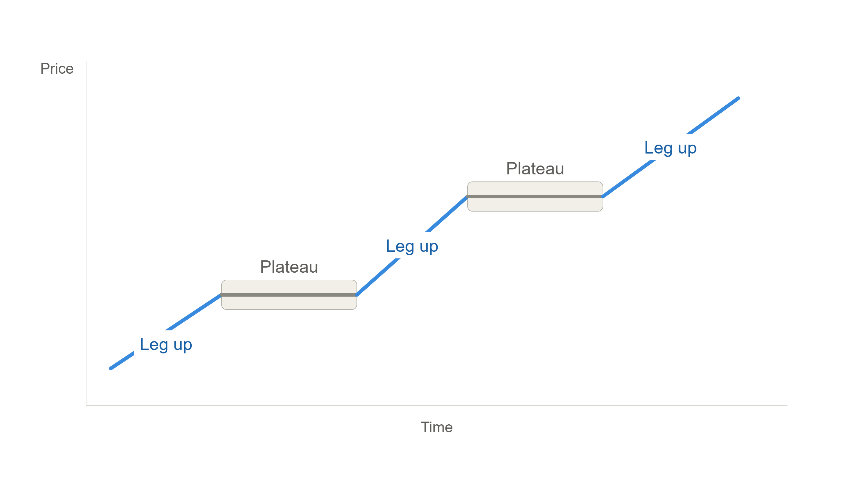
When a stock makes a real move, it runs, and then it stops. It goes sideways for weeks or months. It does nothing. And then, if the story is still intact, it runs again.
Leg up. Plateau. Leg up. Plateau.
It looks like a staircase.
The plateau is not the stock failing. The plateau is the stock working. After a big move, the people who bought early are sitting on profits and want to take them. The stock has to absorb all that selling before it can go anywhere. It has to find new owners at the higher price, people who are willing to hold.
That takes time. That is what the sideways stretch is.
This matters enormously for how you buy stocks, because it tells you where the opportunity is. You are not trying to catch a stock in the middle of a leg, when it is already extended and every buyer is already in. You are trying to catch it at the end of a plateau, right as the next leg begins.
The staircase is the map. Your job is to figure out which step you are standing on.
Support and resistance: floors and ceilings
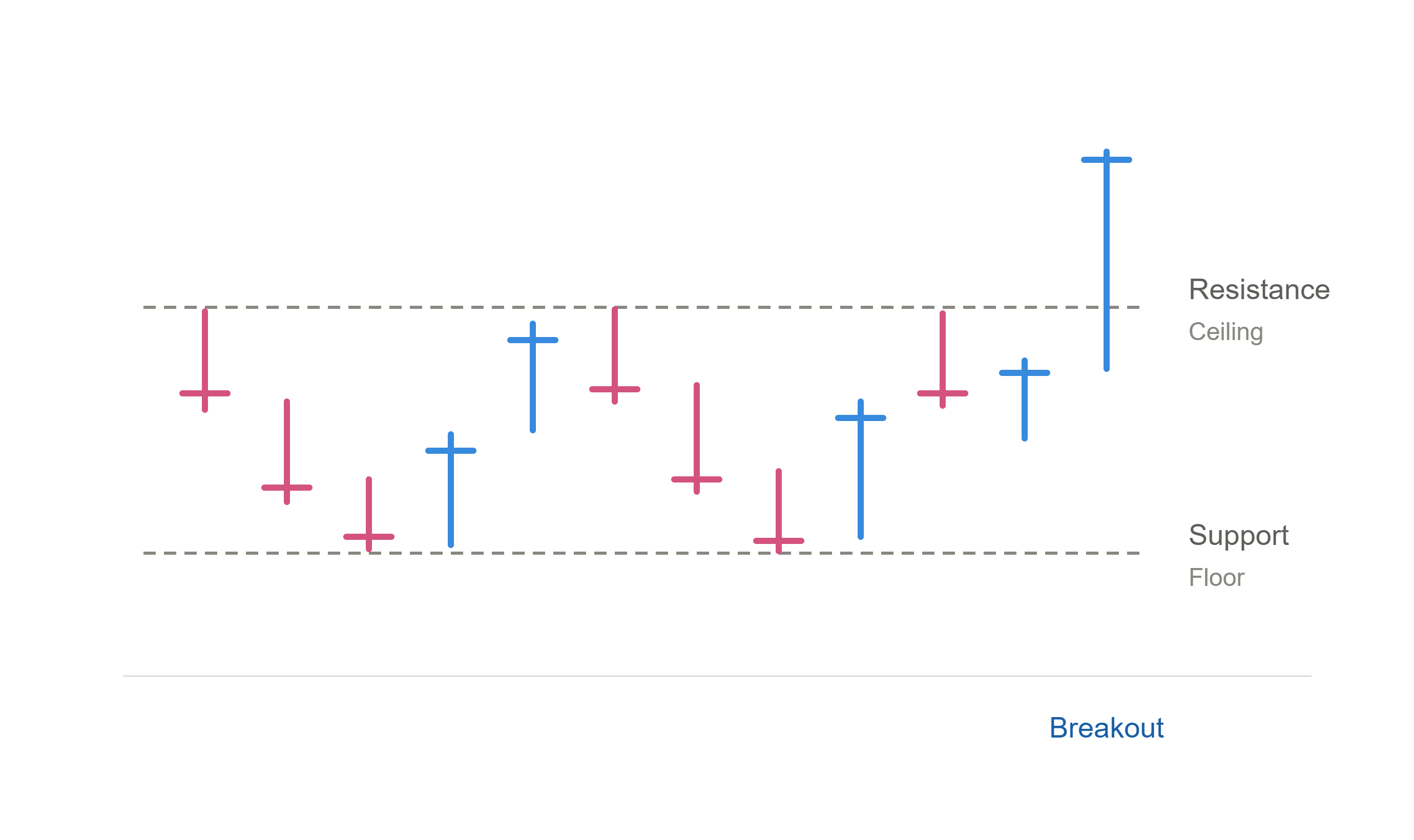
Now zoom into one of those plateaus and look at what is actually happening.
The stock is not sitting still. It is bouncing between two levels.
There is a price it keeps falling to and bouncing off. That is support. It is a floor. Every time the stock gets there, enough buyers show up to stop the decline.
There is a price it keeps rising to and failing at. That is resistance. It is a ceiling. Every time the stock gets there, enough sellers show up to stop the advance.
Floors and ceilings are made of memory. Resistance exists because there are people who bought at that price, watched the stock fall, and have been waiting to get back to even so they can sell. When the price returns, they sell, and the stock stalls. Support exists because there are people who wanted in at that price and missed it, and they are waiting.
So mark them. When you look at a chart, the first thing worth drawing is a horizontal line at the obvious floor and the obvious ceiling.
Now here is where it gets useful.
When a stock breaks through resistance, something has changed. All the sellers who were waiting at that ceiling are gone. They have been absorbed. There is nothing overhead. That break is called a breakout, and it is one of the core ways we buy stocks. It is the moment the next leg of the staircase starts.
When a stock breaks below support, something has also changed, and you need to care about this one more.
That floor was holding for a reason. If it breaks, the reason is gone. The buyers who were defending that level have stopped defending it.
We are defense first at Ghost Alpha, and this is where that lives. Knowing where support is means knowing where you are wrong. If you buy a stock and it breaks the level that was supposed to hold, especially on heavy volume, you do not negotiate with it. You are out.
Buying breakouts is how you make money. Selling broken support is how you keep it. The second one is the harder skill and the more important one.
How does it stack up against everything else
Every stock is in a race against every other stock.
If you are going to pick individual stocks, you had better be picking good ones. Otherwise, buy the index and go do something else with your afternoon. The entire justification for stock picking is that you are getting the cream of the crop.
So how do you know?
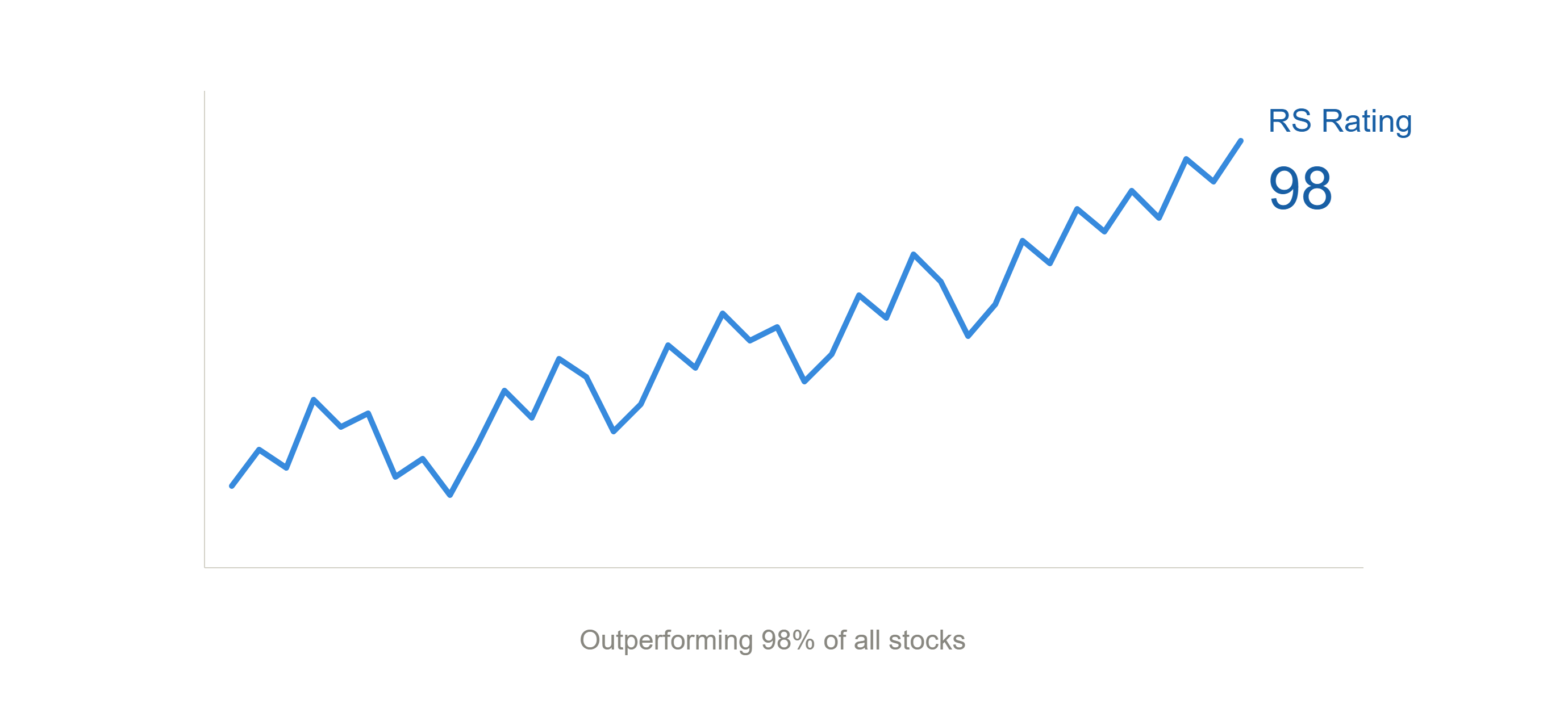
Relative strength rating is a score from 1 to 99 that ranks a stock’s price performance against every other stock in the market, roughly six thousand of them. An RS rating of 90 means the stock has outperformed 90% of all stocks over the last year.
The rule of thumb is simple. Look at stocks with an RS rating of 90 or better. You are not trying to find the one everyone has forgotten. You are trying to find the ones already winning.
The relative strength line is the visual version. It plots the stock’s performance against the S&P 500 as a line underneath the chart. When the line rises, the stock is outperforming the index. When it falls, it is lagging.
The rating tells you where a stock stands right now. The line shows you the history, and history is where the useful signal lives.
The thing to look for is a relative strength line making a new high. When that line pokes into blue sky, it means the stock is stronger relative to the market than it has ever been. That is a stock that institutions are choosing over everything else available to them.
An RS line hitting new highs while the stock is still working on a plateau is one of the most useful things you can see on a chart. The line is telling you what is about to happen before the price does.
Putting it all together
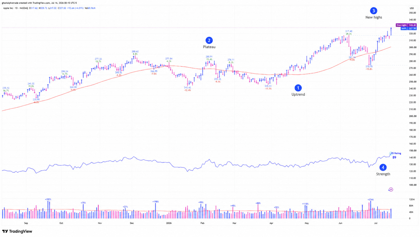
Here is Apple, daily chart, roughly a year of price action.
This is not a recommendation and it is not analysis. Apple is here because it is a stock everyone knows, and because its chart happens to show every component this post covered. We are just labeling the parts.
You now know how to read all four.
1. The trend. The red line is the 50-day moving average. Price is above it and the line is rising underneath. Back in April the stock came all the way down, touched it, and buyers stepped in. That is what an uptrend looks like on a chart.
2. The plateau. From December through April, Apple went sideways. Four months of chop with a floor and a ceiling, going nowhere. That is a step in the staircase.
3. New highs. The most recent bars are at the top of the range. When a stock is here, there is no overhead supply above it, because nobody who owns it is waiting to get back to even.
4. Strength. The blue line at the bottom is the RS line, and it has been climbing since May. The rating sits at 89. Down in the volume panel, that spike in early July at 374% above average is what an elephant looks like when it steps.
That is the whole vocabulary. Trend, staircase, highs, strength, and volume underneath all of it.
Every chart you look at from here is some version of this one.
What this post does not teach you is what to do about it. Reading a chart and deciding where to buy, where to get out, and how much to risk are different skills, and the second one takes longer.
Now that you can read a chart, the actual journey starts.
Reading is the easy part. Everything after this is judgment, and judgment takes reps.
That is what Ghost Alpha is. I post my read on the market most days in Notes, in real time, as it happens. Once a week there is a longer post: analysis, education, an outlook on where the market stands and where the opportunities are setting up.
And every week we go through growth names one by one. Stocks that are actually growing, the ones with a real shot at becoming true market leaders. We look at where they are actionable, what the story is, whether the fundamentals hold up. Same components you just learned, applied to real names in real time.
Stick around. There is a good community here, and everybody in it started exactly where you are right now.
Subscribe below. And if something in this post did not land, reply and tell me. I read every one.
So Good Article to read. 💙🙌⭐ Congrats for more 👏👏
Excellent overview!